In a couple of weeks, several major updates will drop for Invoices and Proposals. This is the biggest update to these tools we’ve done in a while, so we wanted to write this article to prepare you for what’s to come.
The changes include new functionality to help speed up your workflow as well as stylistic refinements that will make your invoices and proposals look even more professional and give your brand more room to stand out.
Sound exciting? We hope so! Let’s dive in.
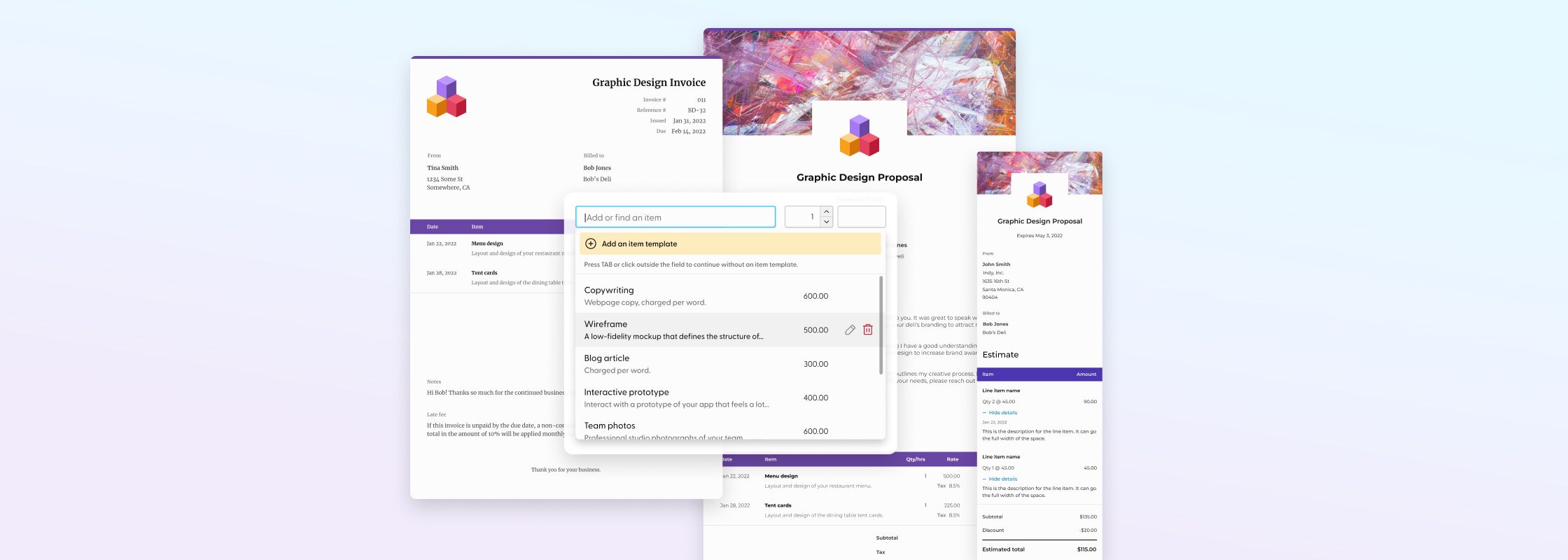
Introducing line item templates
Tired of retyping line items over and over again? Ready to have more control so you can create your invoices and estimates faster? Gear up, because soon you’ll be able to! Many customers have requested this in our feedback forum, through surveys, and interviews. We’ve heard loud and clear.
How does it work?
Line item templates will work in Invoices as well as the estimates block in Proposals. The items you create in both tools are saved to a single database, meaning you can create, search, and select from the same list of line items in both tools. Pretty neat, right?
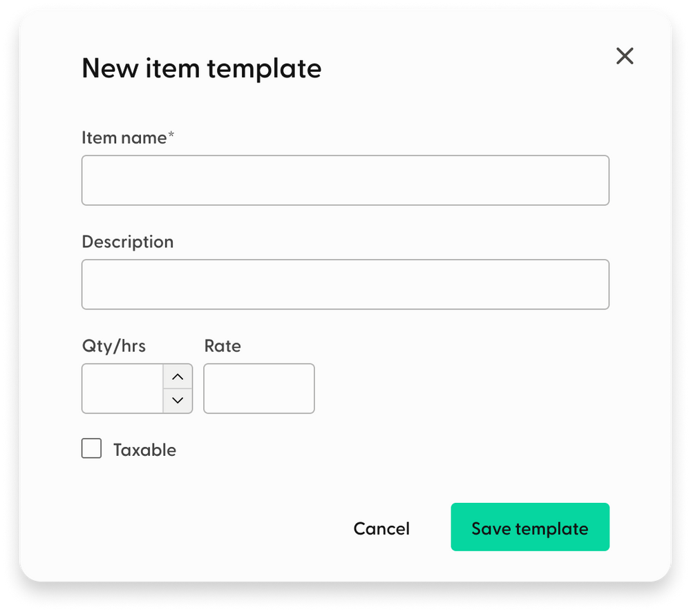
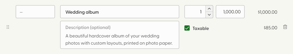
Line item templates include the item name, description, quantity, cost, and whether or not the item is taxable. Dates aren’t included in templates.
When adding line items to an invoice, you’ll be able to seamlessly search through the templates you’ve saved, as well as edit or delete them.
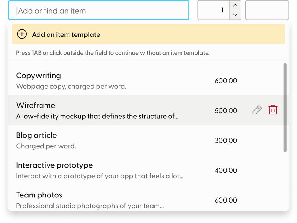
The line items pictured here are just examples; you'll create all the line item templates in your account.
Line item interface updates
You may have already noticed from the mockups above that some visual changes are happening in the interface in this release. Right you are! We sucked the yellow right out of the fields and replaced them with calmer-looking outlined ones. The line item creation area got a complete redesign while maintaining the basic format you’re familiar with.
- The name and description are now stacked instead of in separate columns, giving the text more room and making it easier to read.
- The tax checkbox has moved to a new location so the tax amounts can be viewed per line item. Currently, the tax amount is only reflected in the subtotal area, so this improvement will help you and your recipient see how the math adds up.
Pro tip
Line item templates are a feature exclusive to the Pro plan. Those who are in the free trial or the free plan will need to upgrade to take advantage of this time-saving feature.
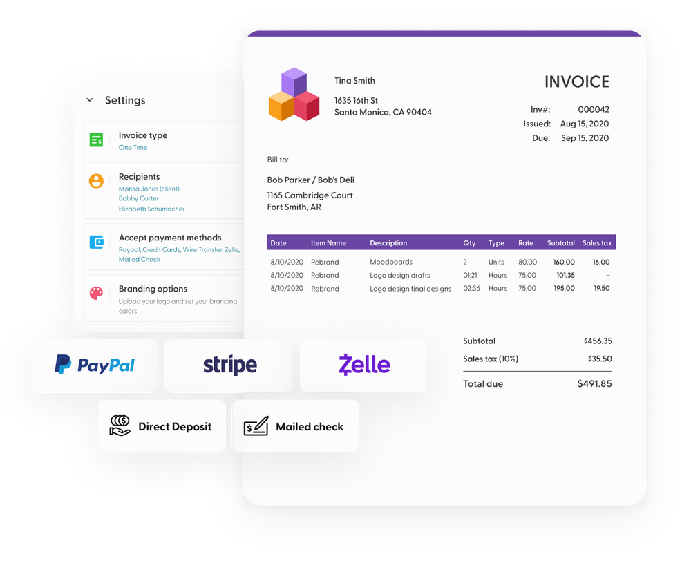
Invoice visual updates
Beyond line items, there’s a wealth of design overhauls coming. We did some spring cleaning and put some elbow grease into the pieces that needed a shine-up. The result? Your brand has a fresh, bold presence and the invoice has a streamlined, modern look. We didn’t reinvent the wheel here, just replaced the treads.
The logo area
Up until now, your logo has been confined to a relatively small square. With the coming update, the logo area is substantially bigger. Have a tall logo or a wide one? No problem, there’s more room for it now. This directly addresses this customer feedback, which we’ve heard from more than just the three who voted on it.
You’ll see that in order to make this change work nicely and not clutter the top area of the invoice too much, we’ve rearranged some things:
Don’t have a logo, or choosing not to add one? No sweat! In that case, the title of the invoice will shift to the left automatically in the preview and the final document you send, like so:
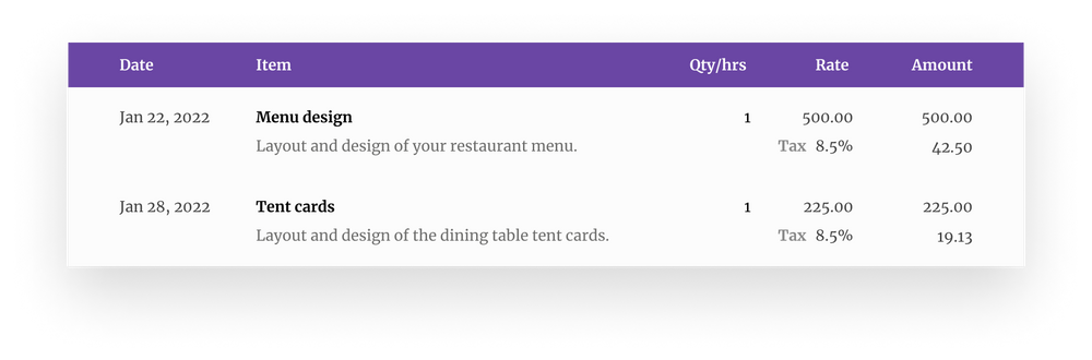
Line items in the final document
Line items have been redesigned in the final rendered invoice according to the changes in the builder.
- The item names and descriptions are stacked instead of squeezed in side-by-side
- The table now spans the full width of the document, giving the invoice a grounded, modern look and feel
- And, of course, as mentioned above, the tax amounts now appear per line item.
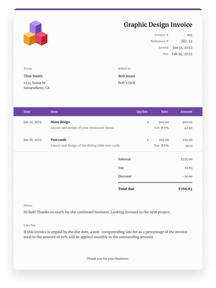
The full picture
Ready to see all of this in action? Here’s a mockup of a full invoice:
The mobile view
The invoice design has been refined for small screen sizes. We’ve eliminated the page-within-a-page look so that invoices fill the screen, making it easier to read the information.

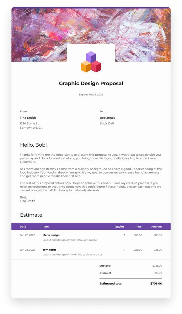
Proposal visual updates
Told you this was a big update, didn’t we? Changes are coming to Proposals, too. Not only have the estimate line items gained the same changes as with Invoices, but the header area has also gotten some TLC.
We’ve made the logo area bigger here to match the same dimensions as with Invoices. Since Proposals first launched, we began to notice through our own experiments, as well as customer feedback, that having the logo and proposal title overlaid on the header image causes some visual overload.
So, we marched in with our feather dusters and spruced the header area up a bit.
Your logo will now have a white background area with plenty of space around it. But the logo area didn’t just undergo a size change; to give the header image more room to shine too, we moved the logo and proposal title down so that they sit partially outside of the header area. These changes add some dimension to the document and give the header image more room to be itself.
The only required element in this area is the title. If you don’t select a header image, no problem: the logo will just shift upward in the final document as if the header image area doesn’t exist. If you don’t upload a logo, no problem; the final document will adjust accordingly. The same goes for the expiration date.
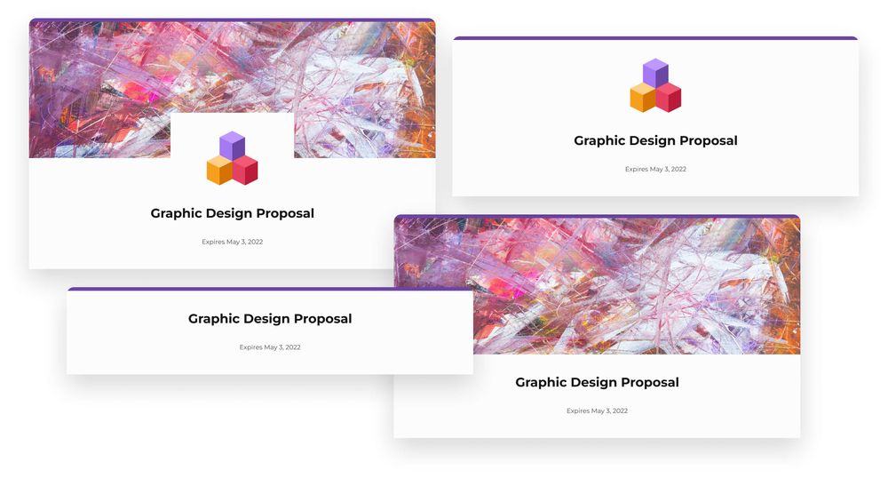
That said, here are variations showcasing what the top of your proposals can look like:
The expiration date is not required.
The full picture
Here’s an example of a proposal with the design changes working together. We’ve kept the information in the mockup brief for the purposes of this demo:
The mobile view
Just like with Invoices, the proposal mobile view has been updated in favor of a cleaner visual treatment. It will no longer look like a page within a page. The header image spans the full width of the screen.

Wrapping up
We hope these changes significantly help improve your workflow and give your brand more space to shine. We’ve snuck in a few small quality-of-life improvements we didn’t mention above, but we’ll leave those for you to find 😉
As always, your feedback is welcome. We’re looking forward to hearing your thoughts, especially when these features are in your hands in just a couple of weeks.
Until then,
✌️ Team Indy