Indy is a product that’s always evolving. So is our company.
Our previous logo, a stacked square with INDY in all caps, was designed when we rebranded to Indy at the beginning of 2021. With some time between that launch and today, we decided to reimagine how we want to represent Indy in the world.
We felt it was a good time to evolve our logo to create some visual distinction between us and similar products in the freelance software market. Also, we really wanted the logo to have a deeper meaning.
As a quick reminder, here’s what the previous logo looked like:
Creating the new logo
As we started this logo redesign, there were a few qualities we wanted it to have. One was a handmade look since the act of creation is a big part of starting and running a freelance business, and freelancers actively produce things for their clients, whether that be a service or a digital or physical product.
Additionally, a few keywords came to mind related directly to freelancing itself.
Deeper meaning: Three I’s
Independence
Freelancers have the freedom and flexibility to say yes (or no) to the projects they want to work on and the people they want to work with. The flexible nature of doing business as a freelancer was something we felt the logo should convey.
Freelancers tend to establish their niche or style in whatever they do, staking their claim and planting a metaphorical flag in the ground.
Interconnectedness
Just as it takes a village to raise a child, it takes a village to run a business of any size. From our experience freelancing and talking with many of our customers, we know that freelancers don’t work solo all of the time; besides collaborating directly with clients, they often bring other professionals into the fold to assist with projects.
There’s a strong sense of interconnectedness at play with freelancing, which meshes tightly with our long-term vision for Indy. This idea of “team spirit” is something that has always resonated with our team, which is why we’ve always had the habit of signing off on our emails and release notes with “Team Indy.”
Improvement
This keyword encapsulates progress, movement, growth, and striving for abundance. The world’s best freelancers are on a relentless quest to improve their business, their skills, or themselves. They’ve discovered that the more they know, the more they realize how little they know, and the hunger to delve deeper drives them.
While it can be easy to fall into a rhythm at a large company, even stagnate, as a freelancer that can spell the end of one’s business. Constant improvement is necessary for freelancers and anyone running an independent small business.
The result
These keywords found their way into the logo’s various shapes and forms. We’ll highlight the logo’s hidden meanings below based on the keywords above.
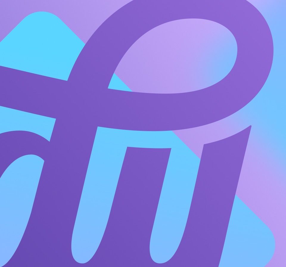
Before we get there, though, here’s the new logo!
The logo’s hidden meanings
Independence …
… is conveyed through the logo’s free-flowing shapes, most notably in the “D” and “Y,” which look like wind blowing through a sail or flag. This metaphor speaks to that independent freelance ideal of steering your business where you want it to go and planting your stake in the ground.
Interconnectedness …
… is drawn into the logo quite literally and doesn’t need a lot of explaining. While the “I” stands on its own to maintain a sense of self, the rest of the letters form a continuous cursive connection.
Improvement …
… is a bit more hidden but very present. The tails on the D and the Y taper into a leafy shape, signifying the improvement aspects of “growth” and “abundance.” The logo has an energy to it, a flowing motion that evokes movement and progress.
In summary
We think our new logo is fun yet professional and speaks to a deeper meaning that will carry us well into the future. We’re quietly steering Indy in interesting new directions based on customer feedback and our vision for the future of work.
We hope you like it.
We can’t recommend Nicolas Fredrickson (The Lettersmith) enough, so check out his work when you have a chance.
Thanks for reading!
✌️ Team Indy