Components to Include in Your Freelancer Website
In part one of the series on Building a Website for Freelancers we talked about when to consider building a website for your brand, focusing on building a MVP (minimum viable product), choosing a domain name, and where to host your site. In this article, we'll discuss the individual components that should be included when building a site.
Home Page
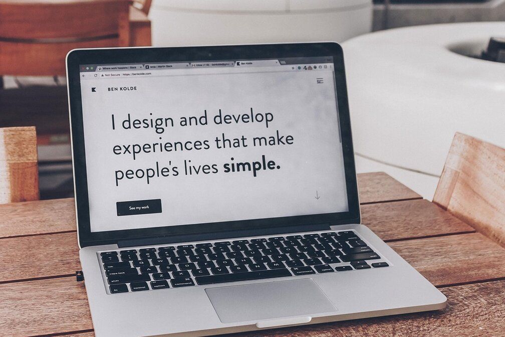
The Home Page is one of the most important pages because it is most often the first page that your users see. The theme and tone of your site should be reflected in the branding, layout, copy, and messaging. Having a theme throughout your site that pulls together the experience you have is valuable. Especially for those who have a diverse skillset. If you have a background in Saas, eCommerce, and LeadGen finding a theme that brings them all together helps better tell your story. In the example shown, one way to bring together the diverse background would be 'a conversion-focused, data-backed marketing strategy'.
Including photos on the home page is a great strategy to making the site come to life more. These can be lifestyle images with you in it- think more photos of you working at a distance, as opposed to a more headshot type.
Other components to include on the home page are a high level of services, one or two testimonials, logos of some of your clients, CTA's (call to action buttons) and contact information.
About
The about page should highlight different information about you. I wouldn't recommend listing it out like a resume or CV, because if people want that, they can see it on your resume or LinkedIn profile. Use the about page to share a high level about your background and who you are. Don't be afraid for it to sound personal. Personal doesn't mean unprofessional and can give users a better idea of who you are and why they would want to work with you. Include a photo of yourself so that people get a better idea of who you are.
Services
The services page is where you should include the different areas you offer. It’s not necessary to include your prices along with the services. In the services page, you can go into more detail about what you offer and some of the specifics.
You wouldn’t want to put this same depth within the home page, so having a separate page allows users to dig in more.
Testimonials
Testimonials should be from some of your past or present clients and focus on your skillset. I'd recommend including a photo of them on your website as it brings an additional level of trust and authenticity.
Testimonials can include recommendations for you as a freelancer or consultant, feedback on projects you worked on, or highlight some of the skills you have.
Case Studies (Optional)
Case Studies are the way that most people expect to see the outcome of work that you have done. This often ties to a number - whether that be monetary, traffic, conversions, percentage increase, etc. Building out your case studies is one of the most time-consuming parts of building your website, but is arguably one of the most important parts.
Portfolios (Optional)
We won’t go into detail about portfolio’s in this article, because it is typically very obvious about when they're applicable or when they’re expected. This is mostly when it comes to creative works - photography, design, videography, and writing.
If you’re including a portfolio, the main choices are whether or not to make it your home page, or include this information in other ways within your website. Determine your goals,
Blog (Optional)
A blog is a great way of showcasing your knowledge, but can also be very time-consuming. Prioritizing a blog on your website would make sense if you have a lot of content that’s already been written and you want to showcase.
Another time where a blog is helpful is if you’re making a campaign to get more brand visibility. If you want people to keep you top of mind, consistently sharing your blog on Linkedin is a valuable way to do this.
Contact Page
The last component that should be included on your website is a contact page. This is fairly simple and straightforward, but you want a place that people have all the information on how to find you.
Having this include the user’s name, email, and an optional message will make it a frictionless experience.


