Google Forms is one of the world's most popular free-form builders and is part of the Google Workspace—also called the G Suite. But, it's not perfect. If you're looking for some great Google Forms alternatives, you've come to the right place.
In this comprehensive guide, we'll showcase some of the best Google Forms alternative options out there to help you expand your horizons and master the art of online forms. Google Forms does not have to be the end-all, and there are plenty of options for you to choose from. In this article, we will look at the Google Forms alternatives you can use and how Indy can help you.
Best Google Forms Alternatives
There are many Google Forms alternatives to choose from. Each has various features and pros and cons, so check out what they offer before switching to one of them.
1. Indy
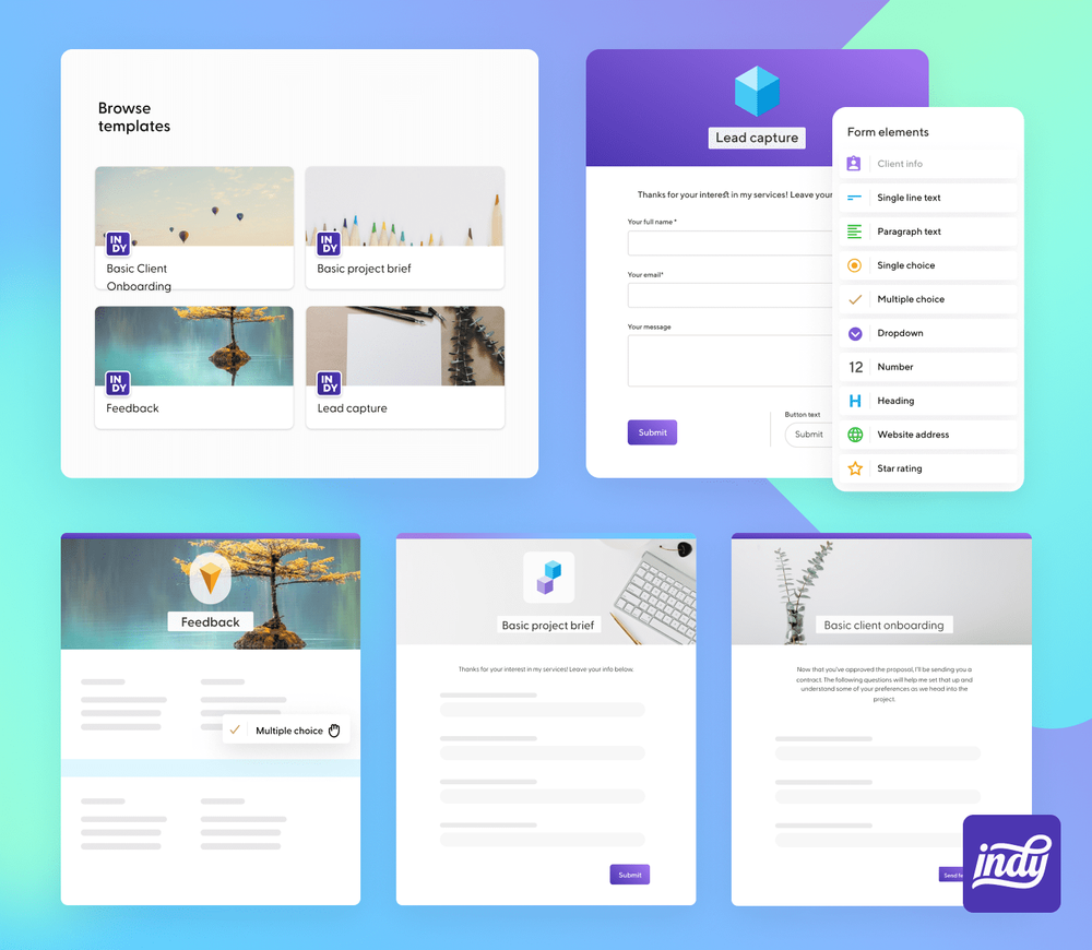
Indy is the first Google Forms alternative on our list and is, in our opinion, the best form builder out there right now. It offers a range of advanced form builder functions through an intuitive, user-friendly interface.
Indy makes use of a flexible template system that provides you with several templates to use. This allows you to create forms immediately while also letting you save any form that you are currently working on to be used as a template later, ready to send at a moment's notice.
The tool also makes it easy to turn leads into contacts. When you receive new form responses, you can convert these new leads into contacts quickly, helping to integrate them into your workflow.
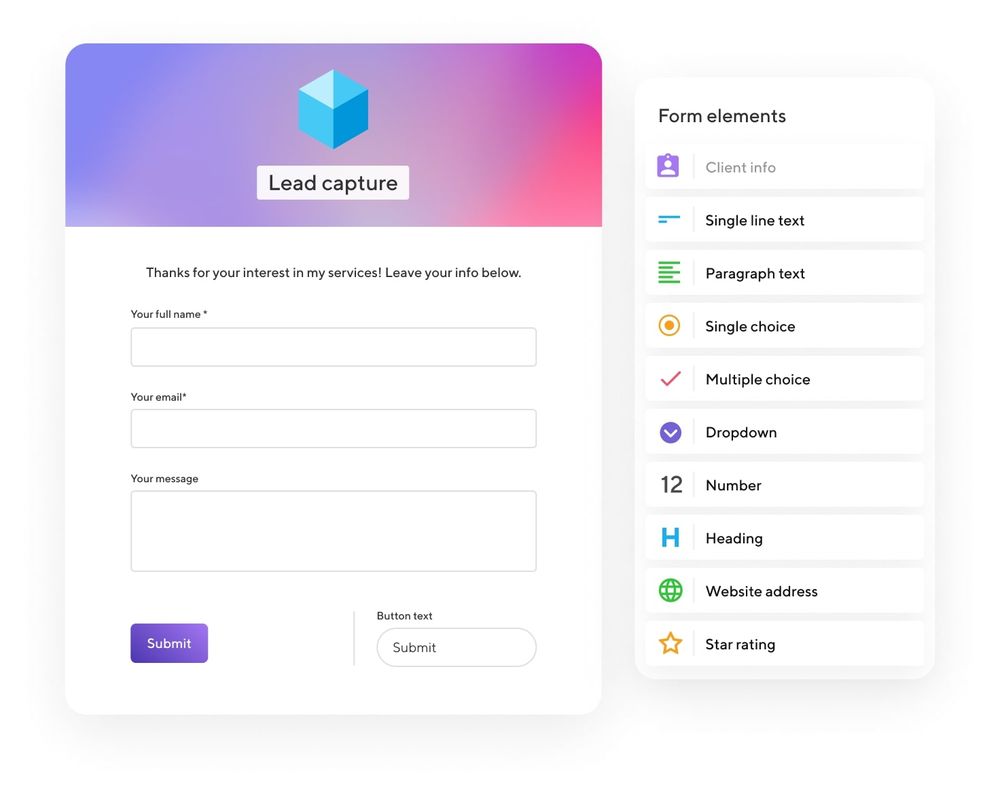
Indy allows you to create beautiful forms from numerous themes and templates. You can add paragraph text, dropdowns, surveys, lead generation, feedback forms, project briefs, multiple choice fields, star ratings, and more with an easy-to-use drag-and-drop form builder. From simple forms to the most complex surveys, you're able to share your Indy-hosted forms almost anywhere.
This includes social media, email, and embedding your form right on your website via a simple link. Along with its easy forms creation, you also get access to other robust project management tools, including proposal, contract, and invoice templates; task management; time tracking; upload files for clients, and more. This makes Indy one of the best Google Forms competitors out there.
Unlike some of the other alternatives to Google Forms, Indy comes with numerous other features that can be accessed with the free plan. This can include online payment solutions, a drag-and-drop editor for invoices, the chance to upload files to client areas, and lots of other tools to help you manage your business. It really is an all-in-one business solution.
2. Formidable Forms
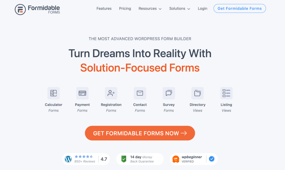
The next Google Forms alternative on our list is Formidable Forms. It's an advanced form builder that works through WordPress, boasting many powerful features that help you create unlimited forms.
Thanks to its intuitive, easy-to-understand visual drag-and-drop form builder, it's easy for anyone to get started using Formidable. This mechanism also allows you to create various forms with just a few clicks, including surveys, quizzes, payment forms, and contact forms.
The great thing about this alternative is that each form design is mobile-friendly and can be customized using the platform's integrated visual styler. If you're more old-fashioned, you'll appreciate the option to edit the form's HTML and conditional logic, showcasing form fields based on a user's form submissions.
The feature that stands out here is that Formidable Forms allows your visitors to perform calculations. For example, you're able to create calculators for mortgage, percentages, or car payments, all of which can be completed through form submissions.
These forms have plugins and different form templates, integrating seamlessly with various email marketing services. You'll find WooCommerce integration that helps you build product forms, making Formidable Forms a great Google Forms alternative for advanced developers and users.
3. Typeform
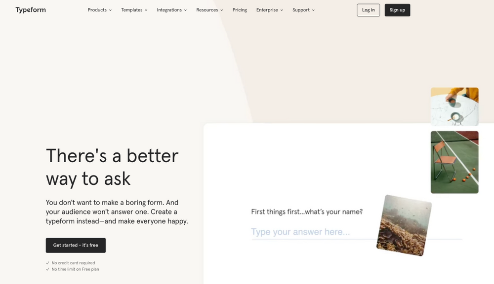
Typeform is another powerful Google Forms alternative packed with all kinds of features, allowing its users to create unlimited forms in various styles and formats. There are several templates to choose from that will help you get started, making the form-creation process a little easier with just a few clicks.
Unlike Indy and Formidable Forms, Typeform is not a drag-and-drop editor, but you can add categories like surveys, quizzes, lead generation, questionnaires, giveaways, polls, and more. It does make it a more challenging form-building process, but one that still provides excellent results.
Once you have chosen a template that you wish to work with, Typeform will ask you the purpose of creating the form and what you intend to use the form for. After that, it will show you a range of pre-generated questions, which you can edit as you please to suit the specific needs of your form.
Typeform provides a few options when it comes to customization. You can edit each question's layout, change the theme and design, and set up conditional logic. What's more, the form-creator offers additional features that make it one of the more attractive Google Forms alternatives.
For example, Typeform lets you set a response limit, show closed messages to visitors, schedule a closing date for your forms, and link your email to receive notifications. The software also integrates with Google Analytics, Google Sheets, Salesforce, Google Tag Manager, and other tools for marketing automation.
4. HubSpot Form Builder
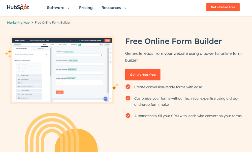
The HubSpot Form Builder is a part of the comprehensive marketing platform available with Customer Relationship Management (CRM), email marketing, and other sales features. You can use it to create unlimited forms that integrate seamlessly with HubSpot CRM, helping you collect the information you need.
With its marketing automation feature, HubSpot helps you set up automatic email follow-up messages to users who have completed one of your forms. What's more, you can also add additional follow-ups using HubSpot's marketing automation and CRM, making this one of the more thorough online form builder options.
When you choose one of the enterprise or professional-level plans, you can access advanced forms that adapt based on the browsing history of your users. HubSpot's Marketing Hub also includes various useful, additional analytics options.
5. Zoho Forms
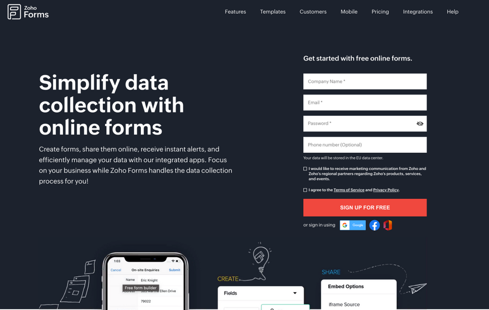
Zoho Forms is one of the Google Forms alternatives that offers a range of templates that are catered to different business units and industries.
For example, Zoho Forms offers business templates, templates for medical institutions, construction companies, HR, eCommerce websites, educational institutions, and more. After you choose a template, you'll have a host of customization options at your disposal, all of which are available through the drag-and-drop online form builder.
With this tool, you can add and remove fields from the form, use conditional logic to set the rules for each field, or create forms with several pages. Zoho Forms also provides integrated security protocols that are designed to limit access to forms and protect your data. These measures provide you with information regarding how your forms are performing, with detailed reports and analytics.
Finally, Zoho Forms has the unique benefit of allowing you to automate workflows with the click of a button. It also routes form data to different apps and integrates seamlessly with the other apps that Zoho offers.
You can use the free trial form to help you get used to the software. You can use this Google Forms alternative to create engaging surveys on custom landing pages.
6. JotForm
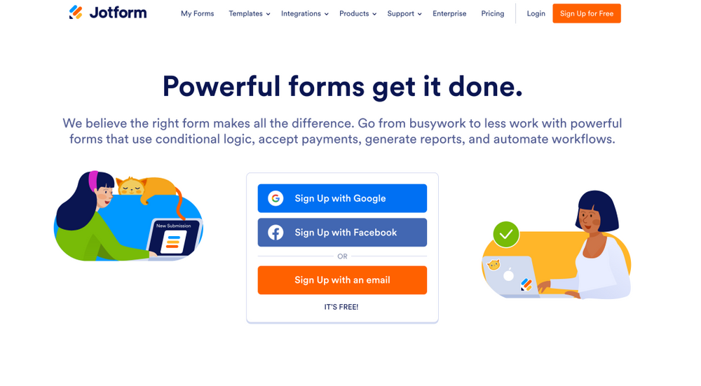
Another advanced contestant in our range of Google Forms alternatives is JotForm, which offers an online form builder with form templates that you can start using for free. The free version of this software allows you to create up to five forms, record 100 submissions, and offers storage of 100MB.
However, if you want more storage space, submissions, HIPAA compliance, and no annoying branding, then you'll have to upgrade to one of the premium plans for this form builder. JotForms does more than just let you create smart forms.
For starters, JotForm provides you with hundreds of templates that allow you to create advanced forms of all kinds, whether it's a registration form, product order form, survey, contact form, or membership form. Each field in the form template can be edited to your specific liking, and JotForm even offers a drag-and-drop builder to make life that much simpler.
One of the most advanced features this form builder offers is the ability to collect payments by integrating your forms with PayPal, Stripe, Square, and a range of other payment services. There is also a range of conditional logic options, such as complex calculation, show and hide fields, hide and skip pages, and more.
Those who want to get started quicker can take advantage of pre-built form templates for free.
7. Wufoo
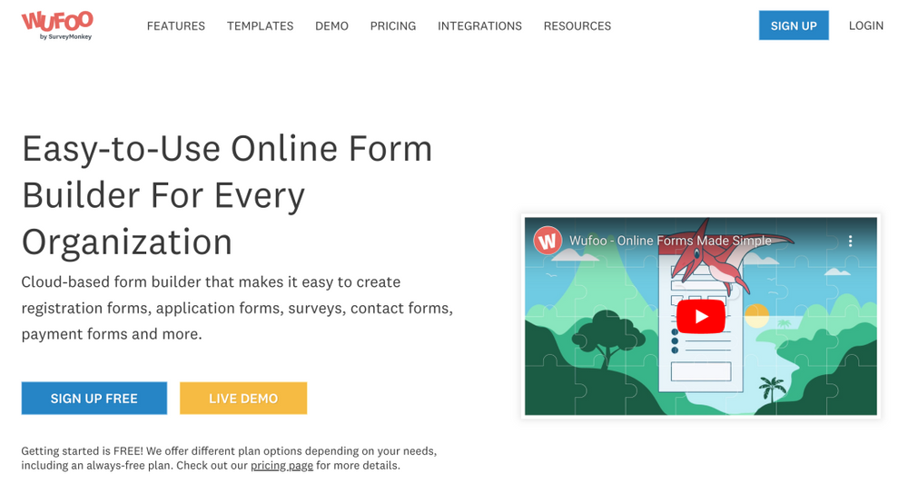
Created by SurveyMonkey, Wufoo is a forms builder that is popular amongst both small businesses and large corporations. As with many other form builders on this list, Wufoo makes things simple by offering a drag-and-drop builder.
Wufoo is one Google forms alternative that has a range of features in a neat package that allows you to create forms with ease.
The Wufoo interface is wonderfully user-friendly, easily allowing you to create various types of forms using a premade template. The tool also allows you to create online forms from scratch, with the drag-and-drop editor making it easy to add new files.
There are customization options available for each field when you create online forms through Wufoo. For instance, you can rename a field, show fields to certain people, add ranges, add placeholder text, and much more.
Wufoo works with Google Analytics form tracking to give you more insights into the forms and who they're reaching. Other features of this alternative to Google Forms include Captcha spam protection, collection of respondents' IP addresses, integration with Google Sheets, and integration with a range of payments services that allow you to collect payments from within forms.
8. Microsoft Forms
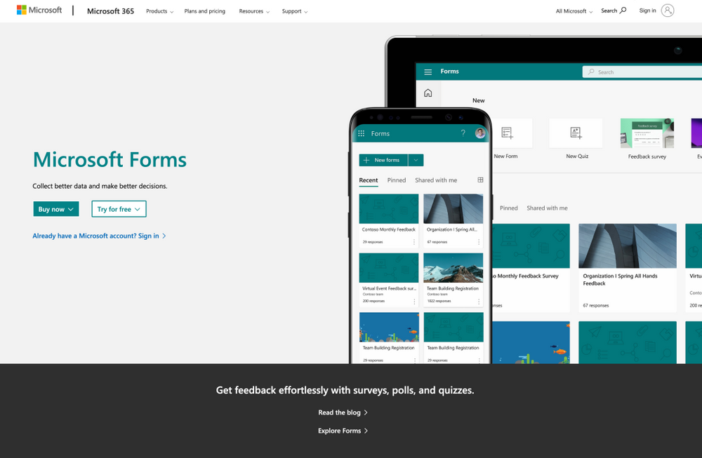
As the name suggests, Microsoft Forms is Microsoft's answer to online form builders and is another good alternative to Google Forms. For anyone who has a subscription to Office 365, it integrates well with other Microsoft services and applications. For instance, you're able to gather data from your form entries and view that data in Excel.
This Google Forms alternative makes it easy to create forms and bears a striking resemblance to Google Forms. You're able to add various form fields, like text, multiple choice questions, ranking, rating, NPS, and more. Each of these fields can be broken down into different sections.
Microsoft Forms has basic form templates that help you get started as quickly as possible. These include event registration forms, surveys for customer feedback, quizzes, and more. However, they are limited in their design and functionality when compared to other online form builders. Though you can create unlimited forms with the tool.
Microsoft Forms is also lacking in a few other features that pretty much all alternatives to Google Forms have. It does not offer conditional logic, nor does it allow you to insert fields to accept payments from customers.
How to Design the Perfect Web Form
You should treat your online survey forms as gateways. In the world of the internet, these are often the only thing between your potential client and something that they want.
Recent research has found that 86% of all internet users fill out at least one web form per week.
Each of these millions of interactions that take place every day is a step in the customer journey and presents an opportunity for you as a business person. Clear and concise forms are the key to bolstering your efforts in lead generation, conversion rates, and customer retention. But, if not aligned with the needs of your users, complex forms become practically useless.
Here's how you can ensure your forms are always effective, enabling you to receive actionable form responses.
Ensure your form is easy to use
The goal of designing any web form is to show your users what is required and then guide them between each of the elements of your form until they have completed it. To achieve this, you want to make sure you are as clear as possible.
Consider implementing the following to simplify your web form:
- Use short labels – Making your labels succinct and short will make it easy for users to scan your form.
- Make labels specific – Rather than simply having a field called 'name', ask for 'first name' and 'last name'.
- Clearly mark required fields – It's generally best to avoid optional fields, but if you can't avoid them, make sure you have a way to clearly let users know which fields are optional and which ones have to be filled in. Adding an asterisk next to required form fields usually does the trick.
- Give some examples – If you think a field might be confusing to users, offer an example to help familiarize them with the format. For instance, a field requiring a birthday input could show 01/01/2000 by default.
- Ensure the form title is easy to understand – The title of your form should tell your users exactly what they receive after completion and the benefits.
Not all of these options will be available on a free trial of the best Google Forms alternatives. So, you might need to pay more to get access to these features.
Remember that you also want to make sure all form data is easy to analyze. So you may want to think about how it can be imported into Google Sheets or another spreadsheet tool. Many of the best Google Forms alternatives will have these features, even on the free trial or free plan.
Pull focus with a CTA (Call to Action)
The CTA button on your forms shows responders what is next in store for them. As such, this button should address the user's end benefits while also capturing their intent.
The text and appearance of this button are essential in making sure the lead conversion is effective. When you're figuring out the design of your CTA button, remember to make it large and unmistakable. It should have an outstanding appearance, and making it interactive when clicked or scrolled over helps draw more attention to it.
Your CTA should be thought of as a springboard. Using descriptive language will help encourage your users to move on from the form submission to the next step in their lead conversion.
Simplify form fields
When you're designing a web form, less will always be more. Shorter forms create less friction for your users, which greatly enhances your chances of turning them into conversions. In fact, reducing the number of form fields you use from four to three can increase your conversions by 25%.
Users generally respond best to forms that use five to seven fields. What's more, you want to avoid overwhelming your users. To do this, you should request only the data needed to further the relationship.
If you absolutely have to include more form fields, try to space them across several pages rather than cramming them onto one. This will reduce your visitors' perceived effort and encourage them to complete the form.
If you're struggling to determine whether your forms are too long or not, take a look at the bounce rates for your form-fill or landing page. If it's high, then you may want to think about reducing the number of fields you have in your forms and A/B testing what works best for your responders.
You can sometimes shorten a form by using conditional logic. So, the respondent gets certain questions if they answer a certain way.
Incorporate visual contrast
Visual contrast is one of the most crucial aspects of designing any web form, as it helps give your users an idea of which areas deserve attention. If you aren't providing them with any immediate visual cues, your users might become confused or overwhelmed and leave your site.
It takes just 0.05 seconds for anyone to decide that they want to leave a web page. If you are able to steer your visitors toward action from the moment they arrive on your form, then you'll experience immense benefits to your conversion rate.
Here are some helpful visual elements to include that can up the contrast of your forms:
- Brightness – Placing a dark object atop a light object will draw attention to it, and vice versa.
- Color – Using complementary and primary colors in conjunction will help your designs stand out amongst the sea of other forms on the internet.
- Object limitation – Placing your web form in a space that does not contain any other competing objects will help catch the attention of your visitors and hold it. When conversion is your goal, it is best to limit distractions as much as possible.
Include the five key elements
Every good web form includes the same five key elements.
- Action buttons – If your user presses a button, an action should take place. For instance, if they press the Submit button, then their response should be recorded.
- Structure – This element includes how you arrange your form layout, how you order the fields, and the connection between each field. Ordering your form in a logical way will make sure you have a frictionless user experience, leading to improved conversion rates.
- Feedback – This interaction should let your users know the final outcome of their input. It can be corrective—"This entry doesn't look right"—or affirmative—"Thanks for signing up!" This also includes any kind of entry validation or assistance that facilitates the process of filling out your form.
- Field labels – These let your user know what is required from an input field. If you think a field might be remotely unclear and confusing to a user, then don't hesitate to include a label explaining what you expect of them for that field.
- Input fields – Input fields are areas that ask for data input from your users. They include things like text fields, checkboxes, password fields, sliders, radio buttons, and more and are an essential part of numerous templates. Try not to include too many different types of input fields, or you may overwhelm the user—two or three different kinds are usually more than enough. Complex forms tend to have fewer responses.
If your web form includes all of the necessary elements, and those elements are arranged in a logical, intuitive way, then it will be both functional and easy to use.
Why Create Web Forms?
Forms facilitate the easy collection and management of information. They can be embedded directly into your website, making it easy for your leads to provide their information to you. After one of your visitors completes a form on your website, their information will be stored until it is ready to be analyzed.
There are several cases where forms can be useful. Some allow you to collect shipping information, contact information, survey your customers, and more. They can collect almost any information from your leads, which can later be used for analysis or management.
Choosing Your Form Type
As you may already know, there is a range of forms. The purpose of your form is used to determine the kind of form you use, which questions to ask, and how your responses should be formatted.
Here are some of the most common form types:
Lead capture form
Lead capture forms are used to convert people visiting your website into leads. They typically require users to input personal information, such as their name, email address, company, phone number, and sometimes a username and password for repeated visits to the site.
Contact form
Contact forms are there for your users to ask your business a question, explain their need for a refund, or voice a concern. As the name suggests, they are there so your visitors and clients can get in touch with your business.
This form will generally contain fields requiring leads to provide their first and last name, contact information, and, in the case of a product query, an order number. You can also include a text entry or drop-down box that allows your users to explain why they are reaching out and how they would prefer you to contact them.
You can create dynamic forms and interactive forms to help you make the contact forms more useful. As the customer enters in an answer, a new set of options can appear that can refine their specific needs.
Consider Amazon using interactive forms as a way to determine what the customer wants to talk about. If they talk about a past delivery, the most recent orders/products will display.
Registration form
Registration forms are usually completed by users interested in registering or signing up for a service you offer. This is one of the most common forms on websites such as eBay and Craigslist.
If a user wanted to list an item for sale on one of those sites, they would first be required to fill out a registration form. This would let them make an account, after which they could post their item.
Order form
Order forms, as the name suggests, are there for when your users want to place an order with you. They also offer your customers a way to pay for their items and have their orders sent directly to the address of their choice.
This form is usually quite detailed and can include several steps before completion. This is because they often require shipping, credit card, billing information, and the contact information of the person placing the order.
Survey form
This is probably the most common web form, as it is a way to collect any information of your choice. They often include fill-in-the-blank, multiple choice, and long-form responses and may also incorporate optional fields for users who don't mind submitting a little extra data.
Online surveys are used to learn more about the experiences that your users have with your website, services, and products. What's more, they can help you improve your interactions with your customers moving forward while also educating your leads about the numerous ways they can benefit from doing business with you.
You can create online surveys using any cloud-based form builder. Though, when you create surveys, be sure you have a specific goal in mind. For instance, do you want to know what they thought of a particular event/service/product? Do they remember seeing a certain advertisement?
Be specific when you create surveys so they aren't too long either. To help, you can use existing forms.
Analyzing Web Form Results
Once you have created a web form, the next thing to do is ensure that it works. Try to think from the perspective of a visitor filling out your form—do they have enough space to respond to a question in a text field? If not, consider changing to a longer field format, and study how their responses start to change.
If you repeatedly get the same feedback from your web visitors, try to change your form or add different fields to help improve the user experience. Your leads and customers, after all, are your highest priority when thinking about any marketing tactic, and the same goes for your forms.
If you opt for email notifications when you create your web form, check that you are receiving those notifications. To do so, visit the web form on your site the same way one of your leads would, then complete it as they would—make sure you receive an email notification about completing this form after you have filled it out.
If you are not getting emails, consider working through the setup process for email notifications again.
Visual Appeal Matters
When it comes to your marketing content, there's perhaps nothing more important than how visually appealing your forms are. It takes just 50 milliseconds for anyone visiting your website to determine whether or not they want to stay from when they first view your landing page.
First impressions matter. Try to brand your forms so they have a professional feel from the second your lead lands on your page. They should match your company's overall aesthetic and theme, promoting consistency and a polished appearance.
Think about things like fonts, colors, layout, and size. Things should be kept minimal, clean, and organized, ensuring your leads always have a positive experience when filling out your forms.
Try to build a rapport with your audience using a conversational form. A conversational form can be more dynamic, and the next question can often be based on the previous answer. You don't always get these with the basic form-building features or a free plan/free trial.
Tell Your Leads Why You Are Asking for Specific Content
If you were completing a web form on any other website and saw a field requesting your credit card information, you'd probably want to know why, wouldn't you? Especially if you weren't buying anything!
This kind of mistake and lack of explanation can cause you to lose a lead incredibly fast while also compromising the credibility of your business. If you want to avoid this issue when you create order forms, include information on your form that provides leads with an explanation as to why you are asking them for any online payments.
By anticipating any questions your leads might feel compelled to ask, you'll come across as much more thoughtful, professional, and passionate about customer service. Remember that uncertainty is the killer of lead generation—if your users feel slightly uncertain about your form, their chances of completing it plummet.
Conclusion
When you're looking for the perfect Google Forms alternative to create advanced forms, there are numerous options on the market. You want an option that allows you to create custom landing pages and multiple forms using an easy to use, drag-and-drop builder. You should also look for an option that offers you a chance to export form data.
Choosing an alternative to Google Forms can often take your business to the next level. Therefore, you can earn more revenue. Indy is the best alternative for any Google Forms user, with a free plan that allows you to work on three contracts a month and numerous other features to help you build an excellent business.


